We talk a lot about data at AccuData. In this post, we talk about a different type of data that’s important for running a business, and how to use that data to make an impact.
Any business-savvy person knows the importance of using data to back up your claims. Is your company productive? Does it reach its goals for growth and increased profits? Does it have an impact on the world?
Without data, it is simply impossible to know the answers to important questions like these ones. However, despite the essential nature of data, many professionals in both for-profit firms and the nonprofit sector struggle to make a crucial point when presenting it: Why does it matter?
In other words, why should anyone— a stakeholder, potential investor, or client— care?
To give a clear and memorable answer while providing the data needed to back up your claims, try telling a story.
The reasons are simple, and understanding the impact storytelling has and how to harness it will help you present your data in a way that makes a case and captures your audience’s attention.
What does storytelling do for my data?
Storytelling makes data more memorable, engaging, and persuasive. Explore the buttons below to learn more.
Storytelling in a business context is less about choosing a protagonist and illustrating what happens to them than it is about keeping a clear line of thought going throughout a presentation and engaging the emotional part of viewers’ brains as well as their analytical minds.
10 Ways to Turn Your Data into a Story
1. Decide which data is most important. Start by asking yourself what your audience is looking to know from your report. What matters most? If you’re not sure, use these guiding questions to find clarity.
What data:
- suggests that we’re needed?
- proves that our service works?
- shows how we’re growing?
- supports client loyalty?
- shows significant changes?
The data that answers these questions is what is most important and should be highlighted as such.
2. Keep things visual. Research shows that you’re likely to have taken in the images on this page before processing the text. Design and presentation platforms like Genially, the one we’ve used above for our infographic, can help you situate your information within an attractive and memorable visual context.
Also because the way you present important and less important information matters, take advantage of a presentation format over a document to highlight your best points by giving it a page of its own or making it more visually salient by using bolder colors, positioning, etc.
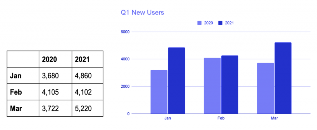
Another important tip to keep in mind is that graphs and charts generally tell clearer stories than number-filled tables. Take a quick look at the comparison below to confirm this for yourself.
3. Start at the very end. Attention spans are increasingly limited, so make your first 10 seconds count. Starting with a bold conclusion entices viewers and leaves clear the significance of what’s to come.
Your audience has seen that your report leads to something exciting, and they’ll be curious to know how you got there and see you back up your claim with relevant data.
4. Weed out irrelevant data. Relevance is everything! It only takes a few extra charts showing numbers that don’t answer central questions to give the impression that you don’t really know what matters to your audience and company.
While it can be tempting to err on the side of extra information out of fear of underwhelming viewers with too little information, each extra set of data waters down the effectiveness of your message.
If you need assistance understanding your data and extracting useful information, a Marketing Analytics company may be able to help.
5. Organize your points as you would a narrative. Whether working from the end backward as suggested in point three or following a more traditional approach, there are ways to group data together that make your story easier to follow.
You may want to organize your data by chronology, especially when comparing previous months or quarters to the current one. Another way to organize your data is by main metrics.
6. Show the human side of your data. Adding a success case to your story is an easy way to make a positive impression and remind viewers of the real-life applications and consequences of your story. Regardless of your role in the company, your job affects users of your service.

While it may not make sense to dedicate a large portion of the available space to a success case, a simple image of positive feedback on a slide that includes positive data can be a strong persuasive element that shows viewers that these numbers translate to happy clients.
Depending on the kind of data you’re sharing, you may even consider telling your story from the point of view of a client or user of your service to show how the data impacts them.
7. Be bold. Don’t be afraid to let your perspective shine through with your numbers. Opinions, as long as they’re well supported, can strengthen the story you’re telling and help bring others onto your side when trying to persuade investors or clients that your product or service works.
There is always room for interpretation, and you can use yours to explain data that paints a grayer picture than was expected as well as to bolster the impact of favorable numbers.
8. Use humor. Yes, this is a business report and not a comic, but a little bit of humor can go a long way to make your audience pay closer attention to your information and make them feel closer to you as you present it. It can also help take the edge off of less than stellar results.

That said, what we’re suggesting is a touch of humor. This isn’t the time to take things too far, and if humor doesn’t come naturally to you, a report isn’t the place to give it another go. If you’re unsure of whether you’ve gone too far, run it by a trusted friend or better yet, a coworker who knows you and your audience well.
9. Check clarity through summary. Once you have a draft of your report ready, make sure you can summarize it in a matter of minutes. If you find yourself struggling to boil your data down to get from point A to point B, you likely lack clarity on what matters most to your audience.
This step is basically a check that you took step one seriously and were able to answer the questions that matter most to your business. If you’re finding this hard to do, don’t worry. You can still course-correct as you streamline your presentation.
10. Declutter your report. The final step is to reorganize your content to make your biggest, boldest, and more favorable points shine. Some content creation platforms make this kind of visual prioritization easier as they give you the option to tuck supporting information away in buttons and expandable windows you or your audience must interact with to see.
This will ensure that your main points are the stars of your report, and your audience will be able to do less work to tell the forest from the trees.
Ultimately, telling a story with your data boils down to being able to keep your audience engaged just as a master storyteller would. Given the number of reports viewers are likely to see, choosing and organizing your data in a way that highlights why it should matter to your audience is key, just as scrapping extra details can help them keep their eye on the prize.
Next time you’re giving a presentation or due to turn in a report, try using some of these tips, and be sure to let us know how it goes. If you’d like a bit more guidance, here are additional ideas on how to tell an effective digital story. If your interest in digital storytelling forms part of a larger quest for more effective practices, you may also want to invest in continued learning for your company.